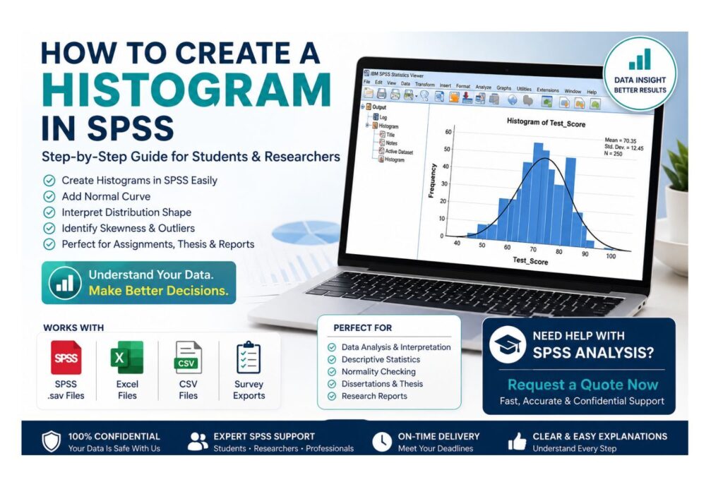
Learning how to create a histogram in SPSS is important when you need to understand the distribution of a numerical variable before running statistical tests, writing dissertation results, or preparing a research report. A histogram helps you see whether values are normally distributed, skewed, spread out, clustered, or affected by unusual values.
Many SPSS users can create a histogram by following menu steps, but they struggle with the part that matters most: interpretation. A histogram is not useful if you do not know what the bars mean, whether a normal curve should be added, how to recognize skewness, how to identify possible outliers, or how to explain the chart in an assignment, thesis, dissertation, or professional report.
A histogram is a data-screening tool. It helps you inspect the shape of a numerical variable before using descriptive statistics, t-tests, ANOVA, regression, correlation, survey scale analysis, or other statistical procedures. If the histogram shows extreme values, unexpected gaps, heavy skewness, or a strange distribution, the dataset may need cleaning or deeper normality checking before analysis continues.
StatisticalAnalysisHelp.com helps students, researchers, and professionals create SPSS histograms, add normal curves, interpret chart output, edit graphs, check distribution shape, prepare Word-ready charts, and write clear results explanations.
Need Help Creating or Interpreting SPSS Histograms? Request a Quote Now
Send your SPSS file, Excel file, CSV file, variable list, assignment instructions, dissertation instructions, supervisor feedback, or SPSS output. StatisticalAnalysisHelp.com can help create histograms, interpret distribution shape, check normality visually, prepare clean charts, write report-ready explanations, and clean your data before analysis.
Request a Quote Now for SPSS histogram creation, output interpretation, graph editing, and analysis-ready reporting.
Quick Answer: How Do You Create a Histogram in SPSS?
The quickest way to create a histogram in SPSS is to use Graphs > Legacy Dialogs > Histogram. This method is simple, direct, and suitable for beginners.
- Open your dataset in SPSS.
- Go to Graphs > Legacy Dialogs > Histogram.
- Move the numerical variable into the Variable box.
- Tick Display normal curve if needed.
- Click Titles if you want to add a chart title.
- Click OK.
- View the histogram in the SPSS Output Viewer.
| Step | SPSS Action | Purpose |
|---|---|---|
| 1 | Open dataset | Load the data you want to graph |
| 2 | Graphs > Legacy Dialogs > Histogram | Open the histogram dialog box |
| 3 | Select numerical variable | Choose the variable to display |
| 4 | Display normal curve | Compare the observed distribution with a normal shape |
| 5 | Add title | Make the chart clearer for reporting |
| 6 | Click OK | Generate the histogram |
| 7 | Review output | Interpret shape, spread, skewness, and outliers |
The histogram will appear in the SPSS Output Viewer. From there, you can inspect the graph, edit the chart, copy it into Word, export it, or use it as part of your results explanation.
If your histogram looks strange or you are not sure how to interpret it, Request a Quote Now for SPSS output help.
What Is a Histogram in SPSS?
A histogram is a graph that shows the distribution of a numerical variable. It groups values into intervals, often called bins, and shows how many cases fall into each interval.
In SPSS, histograms are commonly used for scale or continuous variables such as age, income, exam scores, blood pressure, response time, satisfaction total scores, anxiety scale scores, sales values, or customer rating scores.
The x-axis shows the value ranges of the variable. The y-axis shows the frequency, which means how many cases fall into each range. The bars usually touch because the values represent a numerical distribution rather than separate categories.
A histogram helps you answer practical questions such as:
- Where are most values located?
- Does the distribution look roughly normal?
- Is the variable strongly skewed?
- Are there possible outliers?
- Are there gaps or unusual patterns?
- Is the variable suitable for the analysis you plan to run?
- Does the dataset need cleaning before analysis?
A histogram is different from a bar chart. A histogram is used for numerical distributions, while a bar chart is usually used for categorical variables.
| Chart Type | Best For | Example Variable |
|---|---|---|
| Histogram | Continuous or scale variables | Age, income, test score, blood pressure |
| Bar chart | Categorical variables | Gender, department, group, education level |
| Boxplot | Distribution and outliers | Exam scores by group |
| Line chart | Trends over time | Monthly sales, repeated measurements |
If your variable is categorical, a histogram is usually not the right graph. Use a bar chart or frequency table instead.
When Should You Use a Histogram in SPSS?
Use a histogram when you want to inspect the distribution of a numerical variable. This is common before running statistical tests, reporting descriptive statistics, or checking whether a variable appears approximately normal.
A histogram is useful:
- Before running t-tests.
- Before running ANOVA.
- Before running regression.
- Before checking approximate normality.
- Before reporting descriptive statistics.
- When inspecting possible outliers.
- When reviewing survey scale scores.
- When checking data entry errors.
- When preparing dissertation or thesis results.
- When comparing distributions across groups.
- When deciding whether data cleaning is needed.
- When explaining numerical variables visually.
For example, if you want to run a regression model using exam scores as an outcome variable, a histogram can help you see whether the scores are roughly symmetric, strongly skewed, or affected by extreme values.
A histogram does not replace formal statistical tests. It is a visual inspection tool. Depending on your research requirements, you may still need Q-Q plots, skewness, kurtosis, Shapiro-Wilk, Kolmogorov-Smirnov, or other normality checks.
If you are preparing SPSS results for a dissertation, assignment, or research report, Request a Quote Now for help choosing and interpreting the right graphs.
What Type of Variable Can You Use for a Histogram?
Histograms are suitable for numerical variables, especially scale or continuous variables. In SPSS, these variables are often listed as scale variables in Variable View.
Good variables for histograms include:
- Age.
- Height.
- Weight.
- Income.
- Exam score.
- Blood pressure.
- Response time.
- Monthly sales.
- Anxiety scale score.
- Satisfaction total score.
- Customer rating score when treated as a scale score.
Single Likert items are usually ordinal. For example, one item measured from 1 = Strongly Disagree to 5 = Strongly Agree may be better summarized using frequencies or a bar chart. However, a summed or averaged scale score created from several related Likert items may be displayed using a histogram when appropriate.
Do not create histograms for nominal variables such as gender, marital status, department, yes/no responses, study group, course category, or employment status. These variables are categorical, so bar charts or frequency tables are usually better.
How to Create a Histogram in SPSS Using Legacy Dialogs
The Legacy Dialogs method is one of the easiest ways to create a histogram in SPSS. It is direct, beginner-friendly, and useful when you need a quick graph for one numerical variable.
Follow these steps:
- Open your dataset in SPSS.
- Check that the variable is numeric.
- Go to Graphs.
- Select Legacy Dialogs.
- Click Histogram.
- Select your numerical variable from the left panel.
- Move the variable into the Variable box.
- Tick Display normal curve if you want SPSS to overlay a normal curve.
- Click Titles if you want to add a title, subtitle, or footnote.
- Click Continue.
- Click OK.
- Review the histogram in the SPSS Output Viewer.
Before creating the histogram, check Variable View. Make sure the variable is numeric and that the measurement level is appropriate. If the variable is stored as a string, it may not appear correctly in the histogram dialog or may not produce a useful graph.
The Display normal curve option is useful when you want to visually compare your data with a normal distribution. However, the normal curve is only a guide. It does not prove that the variable is normally distributed.
After the histogram appears in the Output Viewer, inspect it carefully. Look at the shape, center, spread, skewness, gaps, and possible outliers. Do not simply paste the chart into a report without explaining what it shows.
How to Add a Normal Curve to a Histogram in SPSS
SPSS allows you to add a normal curve to a histogram. This curve overlays a normal distribution on the bars so you can visually compare your observed data with a bell-shaped pattern.
To add a normal curve using Legacy Dialogs:
- Go to Graphs > Legacy Dialogs > Histogram.
- Move your numerical variable into the Variable box.
- Tick Display normal curve.
- Click OK.
The normal curve can help you see whether the distribution looks approximately normal. If the bars roughly follow the curve, the distribution may be close to normal by visual inspection. If the bars are heavily skewed, contain multiple peaks, show large gaps, or have extreme values, the distribution may need further review.
However, a histogram with a normal curve does not prove normality. A histogram can look roughly normal but still contain outliers. A small sample may look irregular because there are not enough cases to form a smooth pattern. A large sample may show small deviations very clearly.
For stronger normality assessment, use the histogram together with descriptive statistics, skewness, kurtosis, Q-Q plots, and formal normality tests where required.
How to Create a Histogram in SPSS Using Chart Builder
The Chart Builder method gives more control over chart design and layout. It is useful when you want to customize the chart or prepare graphs for reports.
Steps:
- Go to Graphs > Chart Builder.
- Click OK if SPSS shows a measurement-level warning.
- Choose Histogram from the Gallery.
- Drag the histogram type into the canvas.
- Drag your numerical variable to the x-axis.
- Adjust chart options if needed.
- Click OK.
- Review the histogram in the SPSS Output Viewer.
Chart Builder is useful when you want more control over the graph. It may also be useful when preparing charts for reports, presentations, or visual comparisons.
Legacy Dialogs is usually faster for a basic histogram. Chart Builder is better when you need more customization.
How to Create Multiple Histograms in SPSS
Sometimes you may need histograms for several numerical variables. This is common during data screening, descriptive analysis, normality checking, or dissertation data preparation.
You can create multiple histograms one at a time using the SPSS menu, but syntax is faster when several variables need to be checked.
Example SPSS syntax:
FREQUENCIES VARIABLES=age income test_score
  /FORMAT=NOTABLE
  /HISTOGRAM.
In this syntax:
FREQUENCIES VARIABLES=lists the variables./FORMAT=NOTABLEsuppresses large frequency tables./HISTOGRAMrequests histograms.
This approach is useful when you need to review many variables without producing long frequency tables. It also helps document your data-screening process.
SPSS Histogram Syntax
SPSS syntax is useful when you need to repeat the same graph, document your work, or submit a reproducible analysis file.
Basic Histogram
GRAPH
  /HISTOGRAM=age.
This creates a basic histogram for the variable age.
Histogram With Title
GRAPH
  /HISTOGRAM=age
  /TITLE='Histogram of Age'.
This creates a histogram and adds a title.
Frequencies Histogram
FREQUENCIES VARIABLES=age
  /FORMAT=NOTABLE
  /HISTOGRAM.
This creates a histogram through the Frequencies procedure while suppressing the frequency table.
Syntax is useful when the same graph must be repeated, reviewed, or documented. However, the variable names in the syntax must match your dataset exactly. If your variable is named AgeYears instead of age, the syntax must use the correct variable name.
How to Edit a Histogram in SPSS
After SPSS creates the histogram, it appears in the Output Viewer. You can edit the chart before copying it into Word, exporting it, or using it in a report.
To edit the histogram:
- Double-click the chart in the Output Viewer.
- SPSS will open the Chart Editor.
- Edit the chart title if needed.
- Adjust axis labels.
- Change font size for readability.
- Modify bar appearance if necessary.
- Review the scale and chart layout.
- Close the Chart Editor when finished.
- Copy or export the final chart.
Editing improves readability, but it should not mislead the reader. Avoid changing the chart in a way that hides outliers, exaggerates distribution shape, or makes the data look more normal than they are.
Good chart titles are simple and specific. Examples include:
- Histogram of Age
- Histogram of Total Anxiety Score
- Distribution of Monthly Sales
- Histogram of Patient Satisfaction Scores
If the chart is used in a dissertation or report, make sure the title matches the variable and the written interpretation.
How to Interpret a Histogram in SPSS
Creating the histogram is only the first step. The real value comes from interpretation. A useful interpretation looks at the shape, center, spread, skewness, outliers, gaps, and sample size.
Shape
Shape tells you how values are distributed.
A roughly normal distribution looks like a bell shape, with most values around the center and fewer values at the extremes.
A skewed distribution has a long tail on one side.
A bimodal distribution has two peaks, which may suggest two subgroups, mixed populations, or a variable behaving differently across groups.
A uniform distribution has values spread fairly evenly.
An irregular distribution may suggest a small sample size, data entry problems, mixed groups, or unusual patterns.
Center
The center shows where most values are located. For example, if most exam scores are between 60 and 80, the histogram shows that the main cluster of scores is in that range.
The center can help you understand typical values before interpreting the mean and median.
Spread
Spread shows how widely values are distributed. A narrow histogram suggests that values are close together. A wide histogram suggests greater variation.
For example, two classes may have the same average exam score, but one class may have scores tightly clustered around the average while another has scores spread across a wide range.
Skewness
Skewness shows whether the distribution has a longer tail on one side.
A right-skewed histogram has a long tail to the right. This means most values are lower, but a smaller number of high values stretch the distribution to the right. Income data are often right-skewed.
A left-skewed histogram has a long tail to the left. This means most values are higher, but a smaller number of low values stretch the distribution to the left.
Do not confuse the skew direction with where most bars are located. The skew direction is named after the tail.
Outliers
Outliers appear as bars far away from the main cluster of values. They may represent true values, data entry errors, unusual cases, or measurement problems.
Outliers should be reviewed before analysis. They should not be removed automatically. The correct decision depends on the research design, measurement process, and analysis plan.
Gaps
Gaps are empty spaces between bars. They may occur naturally, but they can also suggest coding errors, missing ranges, grouped data, or mixed populations.
For example, if a histogram of age shows values from 18 to 25 and then suddenly from 50 to 60, the dataset may contain two different groups or a data collection issue.
Sample Size
Small samples can make histograms look rough or unstable. With very few cases, the bars may not form a clear shape. Larger samples usually give a more stable picture of the distribution.
A histogram should always be interpreted with the sample size in mind.
Example interpretation:
“The histogram showed that test scores were approximately normally distributed, with most scores clustered around the middle range and no obvious extreme outliers.”
Another example:
“The histogram suggested a right-skewed distribution, meaning most respondents had lower scores while a smaller number had high values.”
How to Report a Histogram in a Dissertation or Research Paper
A histogram is usually reported as part of visual inspection, data screening, descriptive analysis, or assumption checking. It should be explained clearly and cautiously.
Sample reporting sentences:
“A histogram was used to inspect the distribution of the variable before conducting further analysis.”
“The histogram suggested that the distribution was approximately symmetric.”
“The histogram showed a right-skewed distribution, indicating that most values were concentrated at the lower end of the scale.”
“Visual inspection of the histogram suggested possible outliers, which were reviewed before analysis.”
“The histogram with a normal curve suggested that the distribution was reasonably close to normal.”
Avoid overclaiming. Do not write, “The data were normal” based only on a histogram. A better sentence is:
“The histogram suggested approximate normality by visual inspection.”
If your supervisor or instructor requires formal normality testing, include Q-Q plots, skewness, kurtosis, Shapiro-Wilk, Kolmogorov-Smirnov, or other relevant checks.
Histogram vs Bar Chart in SPSS
A histogram and a bar chart may look similar, but they are used for different types of variables.
| Feature | Histogram | Bar Chart |
|---|---|---|
| Variable type | Continuous or scale | Categorical |
| X-axis | Value intervals | Categories |
| Bars touch? | Usually yes | Usually separated |
| Purpose | Show distribution | Compare categories |
| Example | Age distribution | Gender frequency |
Use a histogram for numerical distributions. Use a bar chart for categories.
For example, age is suitable for a histogram because it is numerical. Gender is suitable for a bar chart because it is categorical. A total satisfaction score may be suitable for a histogram if it is treated as a scale score. A single satisfaction category such as “Low,” “Medium,” and “High” is better shown with a bar chart.
Choosing the wrong chart can confuse readers and weaken your report.
Histogram and Normality Checking in SPSS
Histograms are often used as part of normality checking in SPSS. They help you visually inspect whether the distribution looks approximately normal.
A histogram can support normality assessment by showing:
- Whether the distribution is roughly bell-shaped.
- Whether the distribution is strongly skewed.
- Whether there are extreme outliers.
- Whether the data have unusual gaps.
- Whether the distribution has more than one peak.
However, normality should not be judged from a histogram alone. Other tools may be needed, including Q-Q plots, skewness, kurtosis, Shapiro-Wilk, Kolmogorov-Smirnov, and sample-size considerations.
For large samples, small deviations from normality can become statistically significant. For small samples, the histogram may look unstable because there are not enough cases to form a smooth distribution.
The purpose of normality checking is not to force the data to look perfect. It is to understand whether the assumptions of your planned analysis are reasonable.
If you need help checking normality before t-tests, ANOVA, regression, or other statistical tests, Request a Quote Now for SPSS analysis support.
Common Mistakes When Creating Histograms in SPSS
Many SPSS histogram mistakes happen because users create the graph without checking the variable or interpreting the output carefully.
Common mistakes include:
- Using a histogram for categorical variables.
- Forgetting to check variable type.
- Misinterpreting the normal curve.
- Assuming a histogram proves normality.
- Ignoring outliers.
- Using messy or uncleaned data.
- Using raw item scores when scale scores are needed.
- Reporting the chart without explaining it.
- Using unclear chart titles.
- Copying the chart into Word without checking readability.
- Ignoring missing values.
- Creating too many unnecessary histograms.
- Failing to check whether the variable is numeric.
- Misreading skewness direction.
A histogram is useful only when it is created for the right variable and interpreted correctly. If the underlying data are messy, the graph may also be misleading.
Troubleshooting SPSS Histogram Problems
| Problem | Likely Cause | Fix |
|---|---|---|
| Variable does not appear in histogram dialog | Variable may be string or wrong measurement level | Check Variable View and convert if needed |
| Histogram looks empty | Too many missing values or wrong variable selected | Check data and missing values |
| Bars look strange | Outliers, wrong coding, or invalid values | Review values and run descriptives |
| Normal curve looks poor | Distribution may be skewed or non-normal | Use additional normality checks |
| SPSS output does not show histogram | Dialog options not selected or command not run | Rerun and check Output Viewer |
| Histogram is not suitable | Variable is categorical | Use a bar chart instead |
| Histogram has extreme values | Possible outliers or data entry errors | Check minimum, maximum, and raw data |
| Histogram has too many gaps | Small sample, grouped data, or coding issue | Review variable coding and sample size |
Troubleshooting should begin with the dataset. If the data are coded incorrectly, the graph will also be misleading.
How We Help With SPSS Histograms
StatisticalAnalysisHelp.com helps students, researchers, and professionals create, edit, interpret, and report SPSS histograms.
We can help with:
- Creating histograms in SPSS.
- Editing histograms for reports.
- Adding normal curves.
- Interpreting distribution shape.
- Checking skewness visually.
- Identifying possible outliers.
- Preparing SPSS graphs for assignments.
- Preparing dissertation or thesis results.
- Deciding whether a histogram is appropriate.
- Choosing between histogram, bar chart, boxplot, or Q-Q plot.
- Explaining SPSS output.
- Writing results in clear academic language.
- Cleaning data before graphing.
- Preparing charts for Word reports.
The goal is not only to create a chart, but to help you understand what the chart means and how to report it correctly.
Request a Quote Now for SPSS histogram creation, output interpretation, chart editing, and results reporting.
Pricing for SPSS Histogram Help
Pricing for SPSS histogram help is quote-based because each project is different. A simple histogram request may only involve one or two variables, while a dissertation or research project may require several histograms, normality checks, chart editing, interpretation, and written reporting.
The cost depends on:
- Number of variables.
- Number of histograms.
- Whether data cleaning is needed.
- Whether normality interpretation is needed.
- Whether charts must be edited for Word.
- Whether SPSS syntax is required.
- Whether dissertation or assignment reporting is needed.
- Deadline.
- File condition.
- Whether additional descriptive statistics are required.
| Service Need | What It May Include | Pricing Basis |
|---|---|---|
| Basic histogram creation | Create one or more SPSS histograms | Based on number of variables |
| Histogram interpretation | Explain shape, skewness, spread, and outliers | Based on output complexity |
| Histogram with normal curve | Create and interpret histogram with normal curve | Based on variables and interpretation needs |
| SPSS graph editing | Format charts for reports or Word documents | Based on chart count |
| Normality check support | Histograms, Q-Q plots, skewness, kurtosis, tests | Based on analysis scope |
| Dissertation histogram support | Charts plus written explanation | Based on project requirements |
| Urgent SPSS histogram help | Faster turnaround where possible | Based on deadline and workload |
Request a Quote Now by sending your SPSS file, variable list, instructions, deadline, and required output format.
What You Receive
Depending on your project, you may receive:
- SPSS histogram output.
- Histogram with normal curve where appropriate.
- Edited chart for reporting.
- SPSS syntax where requested.
- Interpretation of distribution shape.
- Notes on skewness, spread, and possible outliers.
- Normality guidance where needed.
- Word-ready chart or results wording.
- Explanation of what the histogram means.
- Revision based on agreed feedback.
The deliverable depends on your instructions, file condition, and reporting requirements.
Why Trust StatisticalAnalysisHelp.com?
StatisticalAnalysisHelp.com provides SPSS-focused support for students, researchers, and professionals who need clear graphs, accurate interpretation, and report-ready results. The service goes beyond screenshots by helping you understand what the histogram shows and how it connects to your analysis.
Support can be based on your SPSS file, exported output, chart screenshots, Word document, assignment instructions, dissertation requirements, or supervisor comments. This is useful when you already have output but do not know how to explain it.
Your files are handled confidentially and used only for the requested project. Personal identifiers may be removed before sharing the data. If your SPSS output, assignment instructions, or supervisor comments are incomplete, support can still be provided using the available files and instructions.
StatisticalAnalysisHelp.com does not promise guaranteed grades, guaranteed approval, guaranteed publication, or statistical significance. The focus is on honest graph creation, accurate interpretation, clear reporting, and practical SPSS support.
Frequently Asked Questions About How to Create a Histogram in SPSS
How do I create a histogram in SPSS?
Go to Graphs > Legacy Dialogs > Histogram, move your numerical variable into the Variable box, select Display normal curve if needed, and click OK. The histogram will appear in the SPSS Output Viewer.
What is the easiest way to make a histogram in SPSS?
The easiest method is Graphs > Legacy Dialogs > Histogram. It is direct and beginner-friendly, especially when you only need a basic histogram for one variable.
Should I use Legacy Dialogs or Chart Builder for a histogram?
Use Legacy Dialogs for a quick basic histogram. Use Chart Builder when you want more control over design, layout, or customization.
What type of variable is suitable for a histogram?
A histogram is suitable for numerical, scale, or continuous variables such as age, income, exam scores, blood pressure, total scale scores, or response time.
Can I create a histogram for categorical variables in SPSS?
You can technically graph many variables, but histograms are not appropriate for nominal categories such as gender, department, or yes/no responses. Use a bar chart or frequency table for categorical variables.
How do I add a normal curve to a histogram in SPSS?
In the Histogram dialog box, tick Display normal curve before clicking OK. SPSS will overlay a normal curve on the histogram.
Does a histogram prove that data are normally distributed?
No. A histogram supports visual inspection, but it does not prove normality. Use Q-Q plots, skewness, kurtosis, Shapiro-Wilk, Kolmogorov-Smirnov, and sample-size considerations when needed.
How do I interpret a histogram in SPSS?
Look at the shape, center, spread, skewness, gaps, and possible outliers. Then explain whether the distribution appears approximately normal, skewed, irregular, or affected by unusual values.
What does a right-skewed histogram mean?
A right-skewed histogram has a long tail to the right. It means most values are lower, while a smaller number of high values stretch the distribution upward.
What does a left-skewed histogram mean?
A left-skewed histogram has a long tail to the left. It means most values are higher, while a smaller number of low values stretch the distribution downward.
What does a bimodal histogram mean?
A bimodal histogram has two peaks. This may suggest two subgroups, mixed populations, or a variable that behaves differently across groups.
How do I identify outliers from a histogram?
Outliers may appear as bars far away from the main cluster of values. They should be reviewed carefully before analysis and should not be deleted automatically.
Can SPSS create multiple histograms at once?
Yes. You can create multiple histograms using SPSS syntax or the Frequencies procedure. Syntax is useful when you need histograms for several numerical variables.
What is the SPSS syntax for a histogram?
A simple syntax example is:
GRAPH
  /HISTOGRAM=age.
Replace age with the name of your variable.
How do I edit a histogram in SPSS?
Double-click the histogram in the Output Viewer to open Chart Editor. You can edit titles, axis labels, fonts, bar appearance, and layout.
How do I copy a histogram from SPSS to Word?
Right-click the histogram in the Output Viewer, choose Copy, and paste it into Word. You can also export SPSS output depending on your file requirements.
How do I report a histogram in a dissertation?
Report what the histogram shows. For example, write that the histogram suggested approximate normality, right skew, left skew, possible outliers, or an irregular distribution. Avoid claiming normality based only on a histogram.
Why does my histogram look strange in SPSS?
A strange histogram may result from outliers, wrong coding, missing values, categorical variables, small sample size, or incorrect variable type. Review your data before interpreting the chart.
Can you help create and interpret SPSS histograms?
Yes. StatisticalAnalysisHelp.com can help create histograms, add normal curves, edit charts, interpret distribution shape, and prepare report-ready wording. Request a Quote Now for SPSS histogram help.
How much does SPSS histogram help cost?
The cost depends on the number of variables, number of charts, interpretation needs, data cleaning requirements, deadline, and required output format. Request a Quote Now for a project-specific quote.
How do I Request a Quote Now?
Send your SPSS file, Excel or CSV file if not yet in SPSS, variable list, assignment instructions, dissertation instructions, supervisor comments, required chart format, normal curve requirements, and deadline.
Order SPSS Histogram Help
Now that you understand how to create a histogram in SPSS, the next step is making sure your chart is suitable, clear, and correctly interpreted. A histogram can help you inspect distribution shape, identify skewness, review possible outliers, and support normality checking before further analysis.
Send your SPSS file, Excel or CSV file if needed, variable list, assignment instructions, dissertation or thesis instructions, supervisor comments, required chart format, whether a normal curve is needed, and deadline.
Request a Quote Now for SPSS histogram creation, normal curve setup, chart editing, output interpretation, and report-ready results.