If you need to build a project timeline without buying separate software, learning how to create a Gantt chart in Excel is one of the most useful skills you can add to your spreadsheet toolkit. Excel doesn’t include a dedicated Gantt chart type, but you can build one using a formatted stacked bar chart, or, for a lighter-weight option, conditional formatting. In this guide, you’ll prepare your project data, build a proper Excel Gantt chart from scratch, add milestones and progress tracking, and learn how to keep the schedule updated as your project moves forward.
What Is a Gantt Chart?
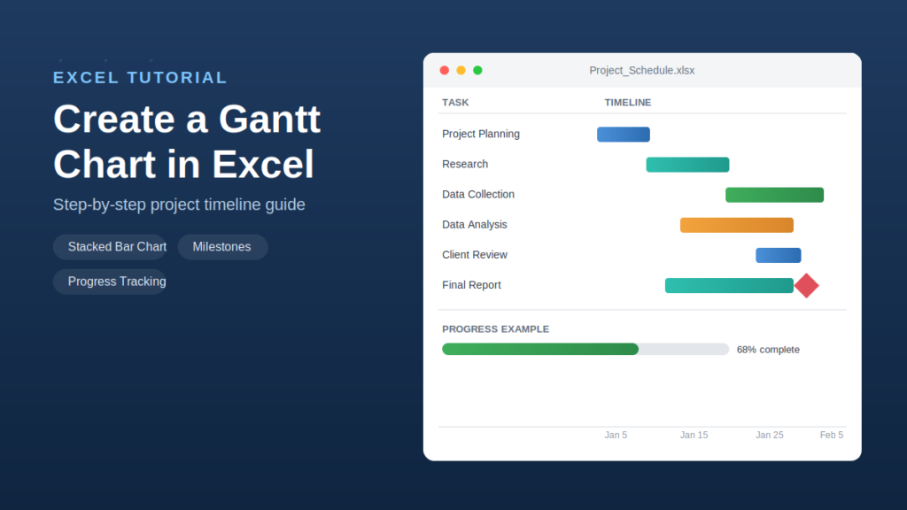
A Gantt chart is a horizontal bar chart used to visualize a project schedule. Each bar represents a task, positioned along a timeline according to its start date and end date, with the bar’s length reflecting its duration. Gantt charts also commonly show dependencies between tasks, key milestones, and overall project progress.
Featured snippet answer: A Gantt chart is a project management tool that displays tasks as horizontal bars on a timeline, showing when each task starts, how long it lasts, and how tasks relate to one another. It gives teams a quick visual overview of a project’s schedule and progress.
Why Use a Gantt Chart in Excel?
Excel is already installed on most business computers, which makes it a practical starting point for project scheduling — no new software, licenses, or training required. Beyond availability, it offers several real advantages:
- Flexible customization — you control colors, labels, spacing, and formatting entirely.
- Good fit for simple to medium-sized projects with a manageable number of tasks.
- Easy sharing — anyone with Excel (or Google Sheets) can open the file.
- No specialized software needed to get a functional, professional-looking timeline.
- Direct connection to existing spreadsheet data, such as budgets, resource lists, or reporting dashboards you already maintain.
That said, Excel has limits. For projects with dozens of interdependent tasks, resource leveling, critical-path calculations, or multi-team collaboration, dedicated project management software will scale better. For most single-team projects and internal planning, though, Excel is more than sufficient.
What You Need Before Creating a Gantt Chart
Before building anything, set up a clean data table with four columns: Task, Start Date, End Date, and Duration.
| Task | Start Date | End Date | Duration |
|---|---|---|---|
| Project Planning | Jan 5 | Jan 8 | 4 |
| Research | Jan 9 | Jan 15 | 7 |
| Data Collection | Jan 16 | Jan 25 | 10 |
| Data Analysis | Jan 26 | Feb 3 | 9 |
| Final Report | Feb 4 | Feb 10 | 7 |
A critical detail: your Start Date and End Date columns must be stored as true Excel dates, not text. If a date is entered as text, it will be left-aligned in the cell by default, and Excel won’t be able to calculate durations or plot it correctly on a chart axis. You can confirm this by checking that dates are right-aligned automatically. If your source data comes from another system, our Data data analysis team can help clean and validate it before you build the schedule.
To calculate duration, use a simple subtraction formula:
=C2-B2+1
The +1 accounts for situations where you want to count both the start day and the end day as part of the task (an inclusive date range). Without it, Excel only counts the days between the two dates, which can understate a task’s actual length by one day.
If you’d rather calculate working days only, skip ahead to the duration formula in the next section.
How to Create a Gantt Chart in Excel
Featured snippet answer: To create a Gantt chart in Excel, enter your project tasks, start dates, and durations, insert a stacked bar chart, make the Start Date series invisible, reverse the task order, and format the horizontal axis as a project timeline.
How to Create a Gantt Chart in Excel in 7 Steps
- Enter your tasks, start dates, and end dates in a table.
- Calculate duration for each task.
- Select the Task, Start Date, and Duration columns.
- Insert a 2-D Stacked Bar chart.
- Set the Start Date series fill to No Fill.
- Reverse the task order on the vertical axis.
- Format the date axis and clean up the chart design.
Step 1: Enter Your Project Tasks
List each task in its own row, along with a start date and end date. Keep task names short and specific “Client Review” is easier to read on a chart than “Review of Deliverables with Client Stakeholders.” Order tasks in the sequence they’ll occur, since this order carries through to the chart.
Step 2 : Calculate Task Duration
Add a Duration column using the formula from the previous section, then copy it down for every task row. If your project only runs on business days, use NETWORKDAYS() instead:
=NETWORKDAYS(B2,C2)
This function counts weekdays between two dates, automatically excluding Saturdays and Sundays (and optional holidays, if you supply a holiday range as a third argument). The difference matters: a task spanning Friday to Monday is 4 calendar days but only 2 working days. Mixing the two methods within the same schedule is a common source of confusion later on, so pick one convention and use it consistently.
Step 3: Select the Required Data
Select the Task, Start Date, and Duration columns. You don’t need the End Date column for the chart itself, since Excel will calculate the bar length from Start Date and Duration together. Holding Ctrl lets you select non-adjacent columns if Start Date and Duration aren’t next to each other.
Step 4: Insert a Stacked Bar Chart
With your data selected, go to Insert → Bar Chart → 2-D Stacked Bar. Excel will generate a horizontal bar chart with two stacked segments per task: one representing the Start Date (as a numeric offset) and one representing the Duration. At this stage, the chart won’t look like a Gantt chart yet—that comes next.
Step 5 : Add Start Date and Duration Series
Excel treats dates as serial numbers internally, so the “Start Date” segment of each bar actually represents the number of days between the chart’s minimum date and the task’s start date. This invisible offset pushes the visible Duration bar to the correct position on the timeline, it’s the mechanism that makes the stacked bar chart function as a Gantt chart.
Step 6: Convert the Stacked Bar Chart Into a Gantt Chart
Click on the Start Date segment of any bar to select that entire data series, then right-click and choose Format Data Series → Fill → No Fill. This makes the offset segment invisible while keeping it in place structurally, leaving only the Duration bars visible. The result is a clean set of floating bars that start and end at the correct project dates.
Step 7: Reverse the Task Order
By default, Excel lists the first task in your data at the bottom of the chart. Click the vertical axis, open Format Axis, and check Categories in Reverse Order. This flips the task list so the first task appears at the top, matching how most people read a project schedule from top to bottom.
Step 8: Format the Date Axis
Click the horizontal (date) axis and open Format Axis. Set the Minimum to your project’s earliest start date and the Maximum to a date shortly after your last task ends, so the chart doesn’t include unnecessary blank space. Adjust the Major unit to control how frequently date labels appear (weekly or biweekly usually works well), and set the Number format to a readable date style, such as mmm d.
Step 9: Improve the Gantt Chart Design
A few finishing touches make a big difference in readability:
- Add a clear chart title, such as the project name.
- Remove or lighten unnecessary gridlines.
- Adjust gap width in Format Data Series to control spacing between bars.
- Use data labels sparingly , task names in the axis are usually enough.
- Choose a simple, consistent font throughout the chart.
- Remove the legend if it only shows “Start Date” and “Duration,” since those labels add no value once the chart is built.
If you regularly build project dashboards like this for reporting, it may be worth exploring our Excel dashboard creation services for techniques that extend beyond a single chart.
How to Create a Gantt Chart in Excel Using Conditional Formatting
The stacked bar chart method is the most flexible, but conditional formatting offers a lightweight alternative that works well for simple schedules. In this layout, dates run horizontally across the top row, and tasks run down the left column.
For each date column, apply a conditional formatting rule using a formula such as:
=AND(F$1>=$B2,F$1<=$C2)
This formula checks whether the date in the column header (F$1) falls between the task’s start date ($B2) and end date ($C2). If it does, the rule shades that cell building a visual bar out of colored cells across the row.
To apply it:
- Select the full range of date cells beneath your date headers.
- Go to Home → Conditional Formatting → New Rule → Use a formula to determine which cells to format.
- Enter the formula above, adjusting cell references to match your layout.
- Choose a fill color and click OK.
This approach is quick to set up and easy to read at a glance, though it becomes harder to manage once a project spans many weeks or months, since each date needs its own column.
How to Add Project Progress to an Excel Gantt Chart
Tracking progress alongside your schedule helps you spot tasks that are falling behind. Add a % Complete column to your data table, alongside Planned Duration and Actual Duration if you want to compare estimates against reality.
| Task | Start Date | End Date | Duration | % Complete |
|---|---|---|---|---|
| Project Planning | Jan 5 | Jan 8 | 4 | 100% |
| Research | Jan 9 | Jan 15 | 7 | 100% |
| Data Collection | Jan 16 | Jan 25 | 10 | 60% |
To show progress visually within the same bar, add a second stacked series representing completed duration (=Duration*%Complete) on top of the Duration bar, formatted with a darker color. This creates a “bar within a bar” effect, showing at a glance how far along each task actually is compared to its planned length. For more ways to represent progress and status visually, see our guide to data visualization in Excel.
How to Add Milestones to a Gantt Chart in Excel
A milestone marks a significant point in a project not a task with duration, but a single moment worth flagging. Common examples include:
- Project approval
- Data collection completed
- Client review
- Product launch
- Final report submission
One straightforward way to mark milestones is to add them as a separate row in your data with a Duration of 0, then plot them as a scatter series layered onto the bar chart at the correct date. Formatting the scatter point as a diamond or star marker visually distinguishes milestones from regular task bars.
How to Make an Excel Gantt Chart Dynamic
A static Gantt chart works fine for a one-time schedule, but most projects change. A few adjustments make your chart update automatically as dates shift:
- Convert your data range into an Excel Table (Insert → Table), so the chart’s source range expands automatically when you add new tasks.
- Use formulas for Duration and % Complete rather than typing in fixed numbers, so updates cascade automatically.
- Apply conditional formatting to flag overdue tasks (for example, where today’s date exceeds the End Date but % Complete is below 100%).
- Use named ranges if you reference the schedule elsewhere in the workbook, such as in a summary dashboard.
None of this requires advanced Excel knowledge — it simply means building the schedule so that updating one cell updates the chart, rather than having to rebuild parts of it manually.
Example of a Gantt Chart in Excel
Here’s a realistic example combining tasks, dates, and progress for a small marketing project:
| Task | Start Date | End Date | Duration | % Complete |
|---|---|---|---|---|
| Kickoff Meeting | Mar 3 | Mar 3 | 1 | 100% |
| Market Research | Mar 4 | Mar 10 | 7 | 100% |
| Content Strategy | Mar 11 | Mar 17 | 7 | 80% |
| Design Assets | Mar 14 | Mar 24 | 11 | 50% |
| Copywriting | Mar 18 | Mar 26 | 9 | 40% |
| Internal Review | Mar 27 | Mar 28 | 2 | 0% |
| Client Approval | Mar 29 | Mar 30 | 2 | 0% |
| Campaign Launch | Mar 31 | Mar 31 | 1 | 0% |
Plotted as a Gantt chart, this schedule would show overlapping bars for Content Strategy and Design Assets (since they run concurrently), a short one-day bar for the Kickoff Meeting and Campaign Launch, and a visible gap in progress once you reach Internal Review, signaling that later-stage tasks haven’t started yet even though the timeline has already begun.
Common Mistakes When Creating Gantt Charts in Excel
- Entering dates as text : Excel can’t calculate or plot them correctly. Fix by re-entering dates using the Date format, or use
DATEVALUE()to convert existing text dates. - Selecting the wrong chart type : a clustered bar chart will not produce a timeline effect. Use a stacked bar chart specifically.
- Leaving the Start Date series visible: this is the single most common reason a chart doesn’t look like a Gantt chart. Set its fill to No Fill.
- Incorrect task order : forgetting to reverse the category axis leaves your first task at the bottom instead of the top.
- Incorrect duration formulas: forgetting the
+1when dates should be inclusive, or using calendar-day formulas when the project actually runs on working days. - Poorly scaled date axes : leaving Excel’s automatic minimum and maximum in place often adds excessive blank space before and after the project timeline.
- Overcrowding the chart: too many data labels, gridlines, or colors make the timeline harder to read at a glance.
- Failing to update the schedule : a Gantt chart is only useful if it reflects current dates and progress, so build in a habit (or automation) for keeping it current.
- Mixing calendar days and working days — pick one duration method per project and apply it consistently across all tasks.
Excel Gantt Chart vs. Dedicated Project Management Software
| Criteria | Excel Gantt Chart | Dedicated PM Software (e.g., Microsoft Project) |
|---|---|---|
| Cost | Usually already owned/licensed | Often requires a separate subscription |
| Ease of use | Moderate learning curve for chart setup | Built-in Gantt tools, less manual setup |
| Automation | Manual unless built with formulas/Tables | Native automatic rescheduling |
| Dependencies | Manual tracking | Built-in dependency logic |
| Collaboration | File-sharing based | Often includes real-time multi-user collaboration |
| Reporting | Customizable but manual | Built-in reporting and dashboards |
| Small projects | Very well suited | Can be more overhead than necessary |
| Complex, multi-team projects | Limited scalability | Better suited for scale and complexity |
For a single project with a modest number of tasks, Excel is often the faster, more practical choice. For large programs with many interdependent workstreams, dedicated software will save time in the long run.
Best Practices for Creating Gantt Charts in Excel
- Keep task names short and specific.
- Define project milestones clearly and mark them distinctly from regular tasks.
- Use consistent date formats throughout the workbook.
- Separate planned progress from actual progress where the distinction matters.
- Avoid excessive formatting — color and decoration should support readability, not distract from it.
- Keep the timeline visually uncluttered, especially for longer projects.
- Update the chart on a regular schedule (weekly is common for active projects).
- Use Excel Tables when your schedule changes frequently, so the chart’s source data stays in sync automatically.
If your team regularly builds schedules like this for reporting or client work, our Excel data analysis team can help set up templates tailored to your workflow.
Frequently Asked Questions About Creating a Gantt Chart in Excel
Can you create a Gantt chart in Excel?
Yes. Excel doesn’t have a built-in Gantt chart type, but you can build one using a formatted stacked bar chart, or a lighter version using conditional formatting. Both methods rely on standard Excel features, so no add-ins are required.
Does Excel have a built-in Gantt chart template?
Excel does not include a dedicated Gantt chart type in its chart menu. However, Microsoft and many third-party sources offer downloadable Gantt chart templates built on stacked bar charts, which you can adapt with your own project data.
How do I create a simple Gantt chart in Excel?
Enter your tasks with start dates and durations, select that data, and insert a 2-D Stacked Bar chart. Then set the Start Date series to No Fill and reverse the category axis order. This produces a basic but functional Gantt chart in just a few steps.
How do I create a Gantt chart in Excel with dates?
Make sure your Start Date and End Date columns use true Excel date values, then calculate Duration with a formula like =C2-B2+1. Build the stacked bar chart from Task, Start Date, and Duration, then format the horizontal axis to display and scale dates correctly.
How do I make a Gantt chart automatically update in Excel?
Convert your task list into an Excel Table so new rows are automatically included in the chart’s data range, and use formulas (not fixed values) for Duration and % Complete. This way, editing a date or progress figure updates the chart without manual rework.
Can I add milestones to an Excel Gantt chart?
Yes. Add milestones as zero-duration entries in your data, then overlay them as a scatter series formatted with a distinct marker shape, such as a diamond. This visually separates milestones from standard task bars on the same timeline.
How do I show project progress on a Gantt chart in Excel?
Add a second stacked series representing completed duration (Duration × % Complete), formatted in a darker shade than the main task bar. This creates a “bar within a bar” effect that shows how far each task has progressed relative to its full length.
What is the best Excel chart type for making a Gantt chart?
A 2-D Stacked Bar chart is the standard choice, since it lets you hide the Start Date offset and display only the Duration as a floating bar. This structure is what produces the timeline effect that defines a Gantt chart.
Conclusion
Learning how to create a Gantt chart in Excel comes down to a repeatable process: prepare your task data with true dates, calculate duration, build a stacked bar chart, hide the Start Date series, format the axes, and update the schedule as the project progresses. Once set up, the same structure can be reused for future projects with minimal rework.
- Prepare project tasks and dates.
- Calculate duration.
- Create a stacked bar chart.
- Hide the Start Date series.
- Format the task and date axes.
- Update the chart as the project changes.
Need help creating advanced Excel project dashboards, timelines, statistical reports, or automated spreadsheets? Contact StatisticalAnalysisHelp.com for professional Excel and data analysis assistance.