How to Interpret Correlation Table in SPSS
Understanding how to interpret correlation table in SPSS can make the difference between a weak results section and a strong one. Many students can generate the table, but they still struggle to explain what the numbers mean, which relationships matter, how to report significance, and how to present the findings in academic language. A good interpretation does more than repeat numbers from SPSS. It explains direction, strength, significance, and meaning in relation to the study question.
If you need broader support beyond this guide, you can also explore SPSS dissertation help, research statistics help, and how to interpret SPSS output. If you are ready to get direct support with your data, Request Quotes Now.
What a Correlation Table in SPSS Actually Shows
A correlation table in SPSS, often called a correlation matrix, shows the relationship between pairs of variables. In most cases, each relevant cell contains three important values: the correlation coefficient, the significance value, and the sample size. Pearson correlation is commonly used for continuous variables with a linear relationship, while other options such as Spearman’s rho are used when the data or assumptions point in a different direction.
Most students make one of two mistakes at this stage. They either focus only on the p-value and ignore the size of the relationship, or they focus only on the coefficient and ignore whether the result is statistically significant. A proper interpretation uses both. The table should be read as a full result, not as isolated numbers.
Why This Table Matters in Academic Writing
In assignments, dissertations, theses, and journal-style reports, the correlation table often appears before regression, factor analysis, or more advanced modelling. It gives an early picture of how variables move together. It can show whether two constructs appear related, whether a hypothesis has initial support, and whether some variables might be too highly related for later models.
That is why interpretation matters. A correlation table is not just descriptive. It helps the reader understand whether higher scores on one variable are associated with higher or lower scores on another, how strong that association is, and whether the relationship is likely to reflect more than random sampling fluctuation.
Main Parts of an SPSS Correlation Table
The three values below are the core of the interpretation.
1. Correlation Coefficient
This is usually shown as Pearson Correlation or Spearman’s rho depending on the analysis. The value ranges from -1 to +1. A positive value means both variables tend to increase together. A negative value means that as one increases, the other tends to decrease. A value near zero suggests little or no linear association.
2. Sig. (2-tailed)
This is the p-value. It helps determine whether the observed relationship is statistically significant. A common threshold is p < .05. If the p-value is below that level, the relationship is usually described as statistically significant.
3. N
This is the sample size used for that pair of variables. It matters because significance is influenced by sample size. A weak correlation may become significant in a large sample, while a moderate correlation may fail to reach significance in a smaller sample.
How to Read the Correlation Coefficient Correctly
The coefficient tells you two things at once: direction and strength.
Direction
Use the sign first.
| Sign of coefficient | Meaning |
|---|---|
| Positive (+) | As one variable increases, the other also tends to increase |
| Negative (-) | As one variable increases, the other tends to decrease |
| Zero or near zero | Little or no linear relationship |
A positive coefficient between study time and test score suggests that students who study more tend to score higher. A negative coefficient between stress and life satisfaction suggests that higher stress tends to go with lower life satisfaction.
Strength
Strength is about magnitude, not sign. The sign tells direction. The absolute value tells strength.
| Absolute value of r | Common interpretation |
|---|---|
| .00 to .19 | Very weak |
| .20 to .39 | Weak |
| .40 to .59 | Moderate |
| .60 to .79 | Strong |
| .80 to 1.00 | Very strong |
These cutoffs are practical writing guides, not rigid rules. In many social science studies, even moderate correlations can be meaningful. Context always matters more than memorized labels.
How to Interpret Significance in the SPSS Table
A result is usually treated as statistically significant when the p-value is below .05. That means the observed relationship is unlikely to be explained by random variation alone. It does not mean the relationship is large, important, causal, or theoretically meaningful by itself.
Use this logic when interpreting:
| p-value | Interpretation |
|---|---|
| p < .05 | Statistically significant |
| p < .01 | Statistically significant, stronger evidence |
| p ≥ .05 | Not statistically significant |
This is where many results sections become weak. Students sometimes write, “There was a significant relationship,” and stop there. That is incomplete. The reader still needs to know whether the relationship was positive or negative, and whether it was weak, moderate, or strong.
Step-by-Step: How to Interpret Correlation Table in SPSS
Step 1: Identify the Two Variables You Are Discussing
Do not try to explain every number in the matrix unless your project specifically requires it. Focus on the variable pairs linked to your research objectives or hypotheses.
Step 2: Check the Correlation Coefficient
Read the coefficient and determine whether the relationship is positive, negative, or near zero.
Step 3: Judge the Strength
Use the absolute size of the coefficient to describe the relationship as weak, moderate, or strong.
Step 4: Check the p-value
Determine whether the relationship is statistically significant.
Step 5: Look at the Sample Size
Confirm the N used in the analysis, especially if different variables have different valid responses.
Step 6: Write the Result in Words
Turn the numbers into a meaningful academic sentence. Explain the association in relation to the study topic.
Step 7: Link It Back to the Research Question
Do not leave the result floating. Show what it means for your study.
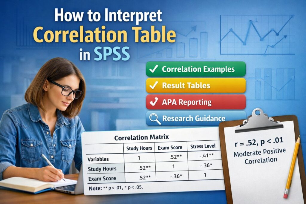
Example of an SPSS Correlation Table
Below is a simple example similar to what many students see in SPSS.
Table 1. Example Correlation Matrix
| Variables | 1. Study hours | 2. Exam score | 3. Academic stress |
|---|---|---|---|
| 1. Study hours | 1 | .52** | -.41** |
| 2. Exam score | .52** | 1 | -.36* |
| 3. Academic stress | -.41** | -.36* | 1 |
Note. p < .05*, p < .01.
How to Interpret Table 1
The table shows that study hours had a moderate positive correlation with exam score, r = .52, meaning students who studied more tended to score higher. Study hours also had a moderate negative correlation with academic stress, r = -.41, suggesting that students who studied more tended to report lower stress. Exam score and academic stress were also negatively related, r = -.36, indicating that higher stress tended to be associated with lower exam performance.
Because the marked coefficients are significant, the results can be described as statistically significant associations. The interpretation should remain focused on association, not causation.
How to Interpret a Positive Correlation
A positive correlation means that both variables move in the same direction. When one increases, the other tends to increase as well.
Example
If motivation and performance have r = .61, p < .001, you can write:
There was a strong positive correlation between motivation and performance, indicating that higher motivation was associated with higher performance.
That wording is clear because it tells the reader the direction, the strength, and the meaning.
How to Interpret a Negative Correlation
A negative correlation means the variables move in opposite directions. When one increases, the other tends to decrease.
Example
If stress and job satisfaction have r = -.58, p = .002, you can write:
There was a moderate to strong negative correlation between stress and job satisfaction, indicating that higher stress was associated with lower job satisfaction.
Many students forget that a negative sign does not mean the relationship is weak. A value of -.70 is stronger than +.30 in magnitude.
How to Interpret a Non-Significant Correlation
A non-significant result does not mean the study failed. It means the evidence is not strong enough to conclude that a relationship exists in the population based on the sample.
Example
If social media use and GPA have r = -.12, p = .274, you can write:
There was a weak negative correlation between social media use and GPA, but the relationship was not statistically significant.
That is enough. There is no need to force meaning into a result that does not support a clear conclusion.
How to Interpret Correlation Table in SPSS With Multiple Variables
Large SPSS tables often contain many variables. The best approach is to stay selective and purposeful. Focus on the most relevant relationships rather than listing every coefficient in order.
Use the following approach:
| What to focus on | Why it matters |
|---|---|
| Relationships linked to hypotheses | Keeps the results section relevant |
| Largest meaningful correlations | Helps highlight the strongest patterns |
| Significant correlations | Supports inferential interpretation |
| Very high correlations between predictors | May signal overlap or multicollinearity concerns later |
When several variables are included, you do not need to write a sentence for every cell. Group related findings into a compact paragraph.
Example Paragraph for Multiple Variables
A review of the correlation matrix showed that self-esteem was positively associated with life satisfaction and resilience, while depression was negatively associated with both variables. The strongest relationship was found between self-esteem and life satisfaction, suggesting that higher self-esteem tended to coincide with better perceived well-being. Depression showed inverse associations with the positive psychological variables, indicating that higher depressive symptoms were linked to poorer outcomes across the model.
How to Interpret Correlation Table in SPSS for Pearson and Spearman Results
SPSS can report different types of correlation. The interpretation style is similar, but the method name must match the analysis used.
| Correlation type | Common use |
|---|---|
| Pearson correlation | Continuous variables with linear association |
| Spearman’s rho | Ordinal data or non-normal/nonlinear ranking situations |
| Kendall’s tau | Smaller samples or ranked association analysis |
The competing pages you mentioned also center heavily on Pearson correlation and its assumptions, especially linearity, continuous measurement, normality, and outlier screening.
If your output says Spearman’s rho, write Spearman’s rho in the results. Do not report it as Pearson’s r.
Results Table You Can Use in Your Blog or Report
Table 2. Interpretation Guide for SPSS Correlation Output
| SPSS value | What it tells you | How to write it |
|---|---|---|
| Pearson Correlation = .47 | Moderate positive relationship | A moderate positive correlation was found |
| Pearson Correlation = -.62 | Strong negative relationship | A strong negative correlation was found |
| Sig. = .003 | Statistically significant | The relationship was statistically significant |
| Sig. = .418 | Not statistically significant | The relationship was not statistically significant |
| N = 210 | Sample size used | The analysis was based on 210 participants |
This kind of table helps readers understand not only what appears in SPSS, but also how to turn output into proper academic language.
How to Write the Interpretation in Results Section Style
A strong results section does not sound mechanical. It should sound clear, direct, and academic.
Weak Writing
There is a correlation of .44 and significance is .001.
Better Writing
There was a moderate positive correlation between customer satisfaction and loyalty, r = .44, p = .001, indicating that higher satisfaction was associated with greater loyalty.
The second version is better because it tells the reader what the result means, not just what number appeared in the table.
APA-Style Examples for Correlation Interpretation
Below are several models you can adapt.
Significant Positive Correlation
There was a significant moderate positive correlation between time management and academic achievement, r(118) = .46, p < .001, indicating that better time management was associated with higher academic achievement.
Significant Negative Correlation
There was a significant moderate negative correlation between burnout and work engagement, r(154) = -.49, p < .001, indicating that higher burnout was associated with lower work engagement.
Non-Significant Correlation
There was a weak positive correlation between age and digital confidence, but the relationship was not statistically significant, r(96) = .14, p = .172.
Common Mistakes When Interpreting a Correlation Table in SPSS
Saying Correlation Proves Causation
Correlation only shows association. It does not prove that one variable causes the other. This is one of the most common interpretation errors across student work and introductory SPSS guides.
Ignoring the Sign
A result of -.45 is not the same as +.45. The sign changes the meaning completely.
Ignoring Magnitude
A statistically significant correlation may still be weak. Always describe size as well as significance.
Overexplaining Every Cell
Large matrices do not need line-by-line narration. Select the meaningful patterns.
Using the Wrong Test Name
If SPSS shows Spearman’s rho, do not call it Pearson correlation.
Reporting Significance Without Context
A p-value should not stand alone. Pair it with direction and strength.
How to Discuss Correlation Findings in a Dissertation or Thesis
In dissertations, the interpretation should move one step beyond the raw result. After stating the direction, strength, and significance, explain what the pattern means for the study.
Example
A moderate positive correlation between organizational support and employee commitment suggests that respondents who perceived stronger institutional support also tended to report greater commitment. This pattern supports the expectation that supportive work environments may be linked with stronger attachment to the organization.
That kind of sentence helps examiners see that you understand both the statistics and the research context.
If your project goes beyond simple association and moves into prediction or multivariable modelling, you can continue with regression analysis help or statistical analysis help. If you want direct assistance with your own SPSS tables, Request Quotes Now.
Best Structure for Reporting Correlation Results
A clean structure usually follows this order:
| Order | What to include |
|---|---|
| 1 | State the test used |
| 2 | Name the two variables |
| 3 | Give direction and strength |
| 4 | Report significance |
| 5 | Briefly explain what it means |
Example Structure in One Sentence
A significant moderate positive Pearson correlation was found between leadership quality and employee morale, r(203) = .42, p < .001, indicating that higher perceived leadership quality was associated with higher employee morale.
How to Interpret Very High Correlations
Very high correlations deserve extra care. If two predictor variables are strongly related, especially above about .80, they may be measuring nearly the same thing. In later analyses such as regression, that can create problems with overlap.
In a blog page, this point helps your content go beyond the basic tutorials. It shows readers that correlation tables are not only about describing relationships. They also help detect whether later modelling may need closer inspection.
Correlation Interpretation Examples by Strength
Table 3. Quick Examples of Wording
| Correlation result | Suggested wording |
|---|---|
| r = .18, p = .041 | A weak positive correlation was found |
| r = -.33, p = .006 | A weak to moderate negative correlation was found |
| r = .57, p < .001 | A moderate positive correlation was found |
| r = -.74, p < .001 | A strong negative correlation was found |
| r = .07, p = .488 | A very weak positive correlation was found, but it was not statistically significant |
These wording examples make it easier for readers to move from output to polished writing.
How to Present the Findings in a Results Table
Table 4. Sample Results Summary Table
| Variable pair | Correlation coefficient | p-value | Interpretation |
|---|---|---|---|
| Study habits and GPA | .48 | < .001 | Moderate positive, significant |
| Stress and GPA | -.29 | .013 | Weak negative, significant |
| Class attendance and GPA | .54 | < .001 | Moderate positive, significant |
| Sleep quality and GPA | .11 | .241 | Weak positive, not significant |
A table like this works well in a blog because it simplifies the matrix into a form that readers can quickly understand. It also works well in a student report when the full SPSS output is too dense for the main text.
When Readers Usually Get Confused
The biggest confusion points are usually these:
- They do not know whether to focus on the sign or the size first.
- They are not sure whether significance alone is enough.
- They do not know how to write a non-significant result.
- They confuse correlation with regression.
- They try to interpret the diagonal values of 1.00, even though those are simply self-correlations.
The diagonal entries in a correlation matrix are always 1 because each variable is perfectly correlated with itself. These are not interpreted as findings.
A Strong Sample Results Paragraph
Pearson correlation analysis was conducted to examine the relationships among study habits, stress, attendance, and GPA. The results showed a moderate positive correlation between study habits and GPA, indicating that students with stronger study habits tended to have higher grades. Attendance was also positively associated with GPA, while stress showed a weak negative relationship with academic performance. Sleep quality had only a weak association with GPA and did not reach statistical significance. Overall, the findings suggest that productive academic behaviour was more strongly related to GPA than general well-being indicators in this sample.
Why This Topic Matters for Students and Researchers
Students often lose marks not because the statistics were wrong, but because the interpretation was too thin. A marker may see the correct SPSS table and still feel that the analysis is incomplete. That happens when the writing only repeats coefficients without explaining what they mean in plain academic language.
A strong correlation interpretation makes your work easier to read, easier to defend, and easier to connect to your literature review and hypotheses. It also gives a better foundation for any later analysis such as regression or mediation.
Final Thoughts
Learning how to interpret correlation table in SPSS is not only about reading coefficients. It is about understanding how variables relate, how strong those relationships are, whether they are statistically significant, and how to explain them in a way that supports the purpose of the study. Once you can do that clearly, your SPSS output becomes more than a table of numbers. It becomes evidence you can use confidently in assignments, dissertations, theses, and research reports.
If you need help interpreting your own correlation matrix, polishing the wording, checking assumptions, or writing the results in a clean academic style, you can explore SPSS help for students, data analysis help, or Request Quotes Now.
FAQ
What does a positive correlation mean in SPSS?
A positive correlation means that both variables tend to move in the same direction. As one variable increases, the other also tends to increase.
What does a negative correlation mean in SPSS?
A negative correlation means the variables move in opposite directions. As one variable increases, the other tends to decrease.
How do I know if the correlation is significant?
Check the Sig. (2-tailed) value in the SPSS table. If the p-value is below .05, the result is usually considered statistically significant.
Should I report all correlations in the matrix?
No. Focus on the relationships linked to your research questions, hypotheses, or key constructs. Large matrices should be summarized selectively.
Can correlation prove causation?
No. Correlation shows association, not cause and effect. A significant correlation does not prove that one variable causes another.
What is the difference between Pearson and Spearman correlation?
Pearson correlation is commonly used for continuous variables and linear relationships. Spearman correlation is often used for ranked or ordinal data, or when Pearson assumptions are not appropriate.
How should I write a non-significant correlation?
State the direction and strength briefly, then note that the relationship was not statistically significant. Do not overstate the finding.
What if my correlation is strong but not significant?
This can happen in smaller samples. A strong coefficient may still fail to reach significance if the sample size is limited.
Do I need to include the sample size when interpreting?
Yes. Including N helps readers understand how many observations were used in the analysis.
Can I use a summary table instead of the raw SPSS output?
Yes. In many academic reports, a clean summary table is easier to read than a full screenshot of SPSS output, as long as the key values are reported clearly.