How to Create Graphs in R
Learning how to create graphs in R is an important step for anyone working with data, assignments, or research results. Graphs make patterns easier to see, trends easier to explain, and comparisons easier to present. A table of numbers can show the data, but a clear visual often makes the meaning of that data much easier to understand.
Many students begin using R for analysis, then realize that creating a clean and readable graph is a separate skill. A graph may run successfully, yet still look unclear because the labels are weak, the wrong graph type was used, or the layout does not match the purpose of the analysis. That is why learning the process step by step matters.
R offers strong tools for visualization, especially through ggplot2. With the right structure, you can create simple graphs, improve their appearance, and present your results more clearly. This guide walks through the process in steps and shows what each result means.
If you need help building clean visuals for coursework or research, Request Quotes Now.
Step 1: Install and Load the Package
Before creating graphs in R, you need the right package. One of the most widely used packages for visualization is ggplot2 because it allows clear and flexible graph creation.
library(ggplot2)
This step installs ggplot2 if it is not already available and loads it into your R session.
Result:
Once ggplot2 is loaded, you can begin creating graphs using a consistent and structured approach. This gives you access to key functions for scatter plots, bar charts, line graphs, and more.
Step 2: Prepare a Simple Dataset
A graph depends on clean and organized data. For this example, a small dataset will be used to show the relationship between study hours and score.
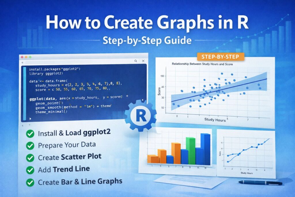
data <- data.frame(
study_hours = c(2, 3, 4, 5, 6, 7, 8),
score = c(50, 55, 60, 65, 70, 75, 80)
)
This creates a basic data frame with two variables. One represents study hours, and the other represents score.
Result:
The dataset is now ready for graphing. Each row contains one observation, which allows R to plot the values clearly. Clean data is essential because poor formatting often leads to weak or confusing visuals.
For more support with preparing data before graphing, see Data Analysis Help.
Step 3: Create a Basic Scatter Plot
A scatter plot is one of the best choices when you want to examine the relationship between two continuous variables.
ggplot(data, aes(x = study_hours, y = score)) +
geom_point()
This code tells R to place study hours on the x-axis and score on the y-axis, then plot each observation as a point.
Result:
The graph shows how the two variables move together. In this example, the points rise from left to right, suggesting that students who study more tend to have higher scores. Even a simple scatter plot can reveal an important pattern quickly.
Step 4: Add a Trend Line
A trend line helps make the overall relationship easier to see.
ggplot(data, aes(x = study_hours, y = score)) +
geom_point() +
geom_smooth(method = "lm", se = TRUE)
The geom_smooth() function adds a fitted regression line. The shaded area around the line shows the confidence band.
Result:
The graph now makes the positive relationship clearer. The upward slope suggests that increased study hours are associated with increased scores. This is useful when you want the reader to see the overall pattern rather than only the individual points.
If your work also includes modeling and interpretation, Regression Analysis Help may be useful.
Step 5: Add a Title and Axis Labels
A graph should always be easy to read. Without labels, the reader may not understand what the graph is showing.
ggplot(data, aes(x = study_hours, y = score)) +
geom_point() +
geom_smooth(method = "lm") +
labs(
title = "Relationship Between Study Hours and Score",
x = "Study Hours",
y = "Score"
)
The labs() function adds a title and labels for both axes.
Result:
The graph becomes much clearer. The title explains what the visual represents, and the axis labels make the variables easy to identify. This small step improves both readability and presentation quality.
Step 6: Improve the Appearance of the Graph
A graph may be correct but still look too plain or cluttered. Themes help improve how the graph appears.
ggplot(data, aes(x = study_hours, y = score)) +
geom_point() +
geom_smooth(method = "lm") +
labs(
title = "Relationship Between Study Hours and Score",
x = "Study Hours",
y = "Score"
) +
theme_minimal()
The theme_minimal() function removes unnecessary visual clutter and creates a cleaner look.
Result:
The graph now looks more polished and more suitable for academic use. A simple theme often improves readability because it keeps the focus on the data instead of distracting background elements.
If you want support with polished graphs for assignments or dissertations, Request Quotes Now.
Step 7: Create a Bar Chart
A bar chart is useful when comparing values across categories.
ggplot(data, aes(x = factor(study_hours), y = score)) +
geom_bar(stat = "identity")
This code converts study hours into categories and displays the score as the height of each bar.
Result:
The chart shows how scores differ across study-hour groups. This is useful when you want to compare categories rather than focus on a continuous relationship. The height of each bar makes the differences easy to see.
Step 8: Create a Line Graph
A line graph is often useful for showing trends, especially when the x-axis follows a natural order.
ggplot(data, aes(x = study_hours, y = score)) +
geom_line()
This draws a line connecting the values in order.
Result:
The graph emphasizes the upward trend in scores as study hours increase. A line graph is especially effective when you want to show gradual movement or progression across ordered values.
Choosing the Right Graph in R
The right graph depends on the purpose of the analysis. A scatter plot works well for relationships between two continuous variables. A bar chart is better for group comparisons. A line graph works best for trends or ordered progressions.
Choosing the wrong graph can make the result harder to interpret. A clear visual should match the question being answered. When the graph type fits the data properly, the findings become easier to explain and much easier to present in academic work.
For broader support with results and interpretation, visit Research Statistics Help.
Common Mistakes to Avoid
One common mistake is creating a graph without clear labels. Another is choosing a graph type that does not match the purpose of the data. Some graphs also become difficult to read because they are too crowded or because the formatting is inconsistent.
A graph should be simple, readable, and relevant to the analysis. Clear titles, suitable labels, and appropriate visual structure make a big difference. The aim is not only to generate a graph, but to make the graph useful.
How to Interpret the Result
After creating the graph, the next step is understanding what it shows. In the scatter plot example, the upward pattern suggests a positive relationship between study hours and score. In the bar chart, differences in bar height show variation across categories. In the line graph, the rising line shows a clear trend.
A graph becomes valuable when it helps explain the result clearly. Instead of reading through long tables, the reader can quickly see the pattern. This improves both understanding and presentation.
Final Thoughts
Understanding how to create graphs in R makes data easier to analyze, easier to explain, and easier to present. The process starts with loading the right package, preparing clean data, selecting the right graph type, and improving the presentation with labels and themes.
When each step is handled properly, the final graph becomes much more than a visual. It becomes part of the explanation. A clear graph strengthens assignments, improves research presentation, and helps the reader understand the result more quickly.
If you need expert support with graphs, analysis, or interpretation in R, Request Quotes Now.
Frequently Asked Questions
How do I create a graph in R as a beginner?
Start by loading ggplot2, preparing a small dataset, and using basic functions such as geom_point(), geom_bar(), or geom_line(). These functions help you build simple graphs while learning how variables are mapped onto the axes.
What is the best package for creating graphs in R?
One of the best packages for creating graphs in R is ggplot2. It is widely used because it provides a clean structure for building visuals and allows you to improve titles, labels, themes, and layout.
Why is my graph in R not showing correctly?
A graph may not display correctly if the data is poorly formatted, variables are mapped incorrectly, or missing values affect the output. Checking the dataset structure and confirming the graph type usually helps solve the problem.
Which graph should I use in R?
The right graph depends on the type of data and the question being answered. Scatter plots are good for relationships, bar charts for comparisons, and line graphs for trends. Choosing the correct graph improves clarity.
How do I make my graphs look more professional?
You can make graphs look more professional by using clear labels, a strong title, and a clean theme such as theme_minimal(). Small presentation changes often improve readability and make the visual more suitable for academic work.