R Data Visualization Help
R Data Visualization Help R data visualization help makes it easier to present data in a clear and meaningful way. Many assignments include analysis that is technically correct, but the results are difficult to understand because the visuals are weak or poorly structured. A graph may be generated, yet still fail to show the actual […]
R Data Visualization Help
R data visualization help makes it easier to present data in a clear and meaningful way. Many assignments include analysis that is technically correct, but the results are difficult to understand because the visuals are weak or poorly structured. A graph may be generated, yet still fail to show the actual pattern in the data.
This is a common problem in coursework. The data is there, the analysis is complete, but the presentation does not reflect the quality of the work. Poor labeling, unclear grouping, wrong chart selection, or cluttered layouts make the findings harder to interpret. A clean and well-structured visual can change that immediately.
R is widely used for visualization because it offers flexibility and precision, especially through tools like ggplot2. At the same time, that flexibility requires careful handling. Small issues in formatting, scaling, or structure can affect how the results are displayed. The goal is to create visuals that are accurate, clear, and directly connected to the analysis.
Request Quotes Now if you need well-structured graphs that make your results easier to present and understand.
Clear Graphs That Communicate Results
A good graph allows the reader to understand the result without reading long explanations. It shows patterns, comparisons, and relationships in a simple and direct way. When visuals are done correctly, they support the analysis and improve the overall quality of the assignment.
Many students produce graphs that technically work but do not communicate clearly. A chart may lack labels, use inconsistent scales, or fail to highlight the key finding. In these cases, the data is correct, but the message is lost.
Clear visuals focus on relevance. Every part of the graph should contribute to understanding the result. The title should describe the output, the axes should be labeled properly, and the structure should match the question being answered. When these elements are aligned, the graph becomes a strong part of the assignment.
Choosing the Right Visualization
Different types of data require different types of visuals. Using the wrong graph often leads to confusion, even when the analysis is correct. Choosing the right structure makes the result easier to interpret and easier to explain.
Comparisons between groups are best shown using bar charts or boxplots. Relationships between variables are clearer with scatterplots. Trends over time are best displayed using line graphs. Each visual has a specific purpose, and selecting the correct one improves clarity immediately.
Many students focus on creating a graph without considering whether it fits the data. When the visual matches the purpose of the analysis, the result becomes much easier to present and defend.
Structured ggplot2 Visuals
ggplot2 is one of the most effective tools for building high-quality visuals in R. It allows detailed control over how graphs are created, but it also requires a structured approach. Without proper setup, graphs can become cluttered or difficult to read.
A well-structured ggplot2 visual includes correct variable mapping, clear labels, and a clean layout. The use of simple themes helps remove unnecessary elements and improves readability. The focus should remain on the data rather than decorative features.
When the structure is clear, the visual becomes more effective. It is easier to interpret, easier to explain, and more suitable for academic work.
Data Preparation for Visualization
Visualization begins with the data. If the dataset is not prepared properly, the graph may show incorrect or misleading results. Issues such as missing values, incorrect formats, or inconsistent categories often affect the output.
Preparing the data involves checking variables, cleaning entries, and organizing the dataset so that it can be used effectively. This may include filtering observations, grouping variables, or reshaping the data.
Once the data is structured correctly, the graph becomes easier to build and more reliable. This step is often overlooked, but it plays a major role in producing clear visuals.
Presenting Trends, Comparisons, and Relationships
Most visuals in academic work are used to show trends, comparisons, or relationships. Each of these requires a different approach and should be handled carefully.
Trends are best shown with line graphs, especially when working with time-based data. Comparisons are clearer with bar charts or boxplots. Relationships between variables are most effectively shown using scatterplots, often with a fitted line.
When the visual matches the purpose of the analysis, the result becomes easier to understand. The reader can quickly see the pattern without needing to interpret large tables of data.
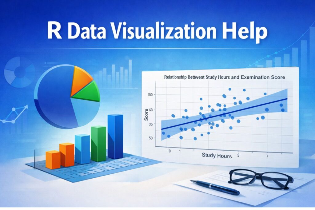
Example of Data Visualization in R
library(ggplot2)

ggplot(data, aes(x = study_hours, y = score)) +
geom_point() +
geom_smooth(method = "lm", se = TRUE) +
labs(
title = "Relationship Between Study Hours and Examination Score",
x = "Study Hours",
y = "Score"
) +
theme_minimal()
This type of graph shows how two variables are related. The data points display the observations, while the fitted line highlights the overall trend. This makes the result easier to interpret and explain.
Improving Graph Readability
A clear graph should be easy to understand at a glance. This means using readable labels, appropriate scales, and simple formatting. Overly complex visuals often make the data harder to interpret rather than easier.
Improving readability may involve adjusting colors, simplifying legends, and removing unnecessary elements. These changes help focus attention on the result rather than the structure of the graph.
When the visual is clean and well-organized, the reader can focus on the meaning of the data. This improves both clarity and presentation.
Visuals That Match Academic Standards
Academic assignments require visuals that are not only correct but also properly presented. A graph should support the analysis and align with the written explanation. If the visual shows a pattern or relationship, the interpretation should explain that pattern clearly.
Different assignments have different requirements, but the principle remains the same. The visual should be relevant, clear, and easy to understand. When the graph and the written results are consistent, the assignment becomes stronger.
For additional support with analysis and reporting, you may also explore
Turning Data Into Clear Results
Raw data alone is often difficult to interpret. Visualization transforms that data into something meaningful. It allows patterns to be seen quickly and helps explain results more effectively.
The process involves preparing the data, selecting the correct visual, building the graph, and refining it until it clearly represents the findings. Each step contributes to the final quality of the work.
When done properly, visualization turns complex data into clear and understandable results.
Strong Visuals Improve Your Work
A well-prepared graph improves an assignment immediately. It shows that the data has been handled correctly and that the results are presented clearly. It also makes the work easier to read and evaluate.
Weak visuals reduce the impact of the analysis. They make it harder to understand the results and can create confusion even when the data is correct. This is why clear visualization plays an important role in academic work.
R data visualization help ensures that your graphs are accurate, clear, and ready for submission.
Request Quotes Now if you need professional, clean, and well-structured visuals in R.
Frequently Asked Questions
How do I create clear graphs in R for my assignment?
Creating clear graphs involves choosing the right chart, labeling it properly, and structuring the data correctly. The visual should match the question and highlight the key result without unnecessary complexity.
Why are my R graphs not showing the correct results?
This usually happens when the data is not properly prepared. Issues such as missing values, incorrect variable types, or wrong groupings can affect how the graph is displayed.
What is the best graph to use in R?
The best graph depends on the type of data. Scatterplots show relationships, bar charts compare groups, and line graphs display trends over time.
Can you improve my existing graphs?
Yes. Graphs can be refined to improve clarity, labeling, and structure so they better represent the findings.
How do I make ggplot2 visuals look professional?
Professional visuals focus on clear labels, simple themes, and clean structure. Removing unnecessary elements improves readability.
Why is data preparation important?
Clean data ensures that the graph reflects accurate results. Without proper preparation, visuals may be misleading.
Are R visuals acceptable for academic work?
Yes. When properly structured and labeled, R visuals are widely accepted in academic assignments.
How do I show trends clearly in R?
Trends are best displayed using line graphs with clear labeling and consistent scaling.
What makes a good visualization?
A good visualization is simple, clear, and directly connected to the analysis.
How can I get help quickly?
You can Request Quotes Now by sharing your assignment details and dataset.